Points of interest
Eric Fischer’s digital maps turn geographic data into works of art.
By Amy Braverman Puma
Images by Eric Fischer, AB’95
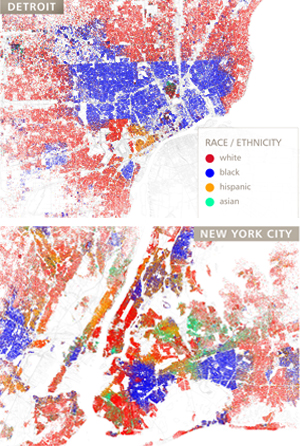
When Eric Fischer saw a digital map by cartographer and historian Bill Rankin, plotting Chicago’s population with race and ethnicity data from the US Census, he was “astounded.” The colored dots, each representing 25 people, sharply followed neighborhood borders: red dots in white neighborhoods, blue dots in black neighborhoods, orange dots in Hispanic neighborhoods, and green dots in Asian neighborhoods. Few areas on the map—published in the Spring 2010 Perspecta, the Yale School of Architecture’s journal—showed more than one color.
“I knew Chicago was a segregated city, but I didn’t know a lot of the details of how it was segregated,” says Fischer, AB’95. “I was surprised by the huge extents of the areas dominated by one race or another and the sharpness of the boundaries between the areas.”
Fischer, a programmer at Google and map aficionado on the side, decided to see how other cities looked when mapped this way. Last September he downloaded the census data (using the 2000 numbers then available) and plugged them into some self-written programs. He posted to his Flickr account his own map of Chicago; the San Francisco Bay Area, where he lives; Detroit, another city with stark divisions; and eventually 105 more (he updated the maps with 2010 census figures this past March). Bloggers linked to his set, which eventually reached the Time magazine and London Daily Mail websites.
“I think what I’m doing that appeals to people is telling them things they already know but on a larger scale,” he says. “Everybody knows how their neighborhood and maybe how their cities work, but being able to affirm the patterns they see and broaden them to a larger scope than they can observe, that’s probably the appeal.”
The race and ethnicity series was the second set of Fischer’s maps to generate such interest. Last May he posted to his Flickr photostream what he called a Geotaggers’ World Atlas, maps of several cities showing the number of photographs people took in different locations, as recorded by Flickr and Picasa geotagging data—location information embedded in digital cameras or that people upload themselves. He also colored the maps by assumed transportation mode: “Based on time stamps, you can tell how quickly people moved”—60 miles an hour meant driving; three miles an hour meant walking. The maps were dark in busy areas and light in sparser places, a mesh of vectors.
The Flickr Blog pointed to Fischer’s atlas, drawing a wide audience. Readers called them tourism maps, and in June he tried to figure out if that assumption was accurate, coloring the points and vectors by whether the photographs were taken over a short or extended period. Like the race and ethnicity maps, the results rang strikingly true to cities’ reputations—tourist and local areas seemed spot on. The Boston Globe printed the Boston locals and tourists map. Toronto’s CBC News gave two minutes of airtime to the Toronto version. “I also thought it was great when the New York Times Magazine didn’t print a map but just casually mentioned the Geotaggers’ World Atlas,” says Fischer, “as if it was something that people reading the paper would already have known about.”

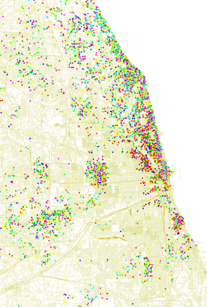
The Magazine asked Fischer to plot patterns in the world of Chicago alumni. Using location data we sent him, he mapped a selection of cities and color coded them by graduation decades. View a slideshow of the complete set of UChicago alumni maps.
His interest in maps began at the Regenstein Library. In the basement stacks, the linguistics major was looking up, for personal interest, the origins of the modern keyboard layout. “Somewhere in ‘HF’ is the section on office equipment,” he recalls, “which is conveniently located next to communications and transportation.” He wandered over and found historical books of Chicago transit maps. The volumes sparked Fischer’s hobby of collecting old maps of Chicago and then San Francisco.
“My interest in historical maps is basically transportation history,” he says, “especially history of transportation plans that didn’t come to pass, grand plans that did not succeed. That’s the thing that initially hooked me in the Reg.” One book had 1937 plans to pave the “L” tracks and put in a freeway. “It would have been totally disastrous, both as a transit system and as an expressway system.”
After graduating, the Indianapolis native moved to Madison, Wisconsin, and then returned to Chicago, working first for a website-design company and then for the University, doing computer support in the Research Institutes. He moved west in 2000. In San Francisco, he says, “it’s easier to walk around a much larger area than I ever felt I could in Chicago.” Living in Hyde Park, he felt separated from the city proper. San Francisco, where he’s lived and worked, “feels less fragmented to me than Chicago ever did.”
At Fischer’s current house in Oakland, maps hang on the walls, including circa 1900 US Geological Survey maps and 1850s US Coast Survey maps of coastal American cities. “They were the first to do topographic maps with contour lines to show elevations.”
Today Fischer is among those taking maps into new territory. He doesn’t consider himself a cartographer: “It’s more trying to understand and present patterns than cartography as such.” He calls his maps visualizations. “If you’re looking at a big table of numbers, it doesn’t tell you anything,” he says. “But if you can plot the numbers and how fast things move from one location to the other, you can sort of see the patterns of the world.”
The Magazine asked Fischer to plot patterns in the world of Chicago alumni. Using location data we sent him, he mapped a selection of cities and color coded them by graduation decades (2000s are red, 1990s blue, 1980s green, 1970s yellow, 1960s purple, and earlier is cyan).

