Cinderella at the ball is the same person, only better. The frocks she wears to clean her stepmother's home might have been new when her stepsisters wore them, but by the time we meet her they're ragged hand-me-downs. The ball gown that her fairy godmother bestows not only improves Cinderella's outward appearance but also makes her smile, stand tall, and exude confidence.
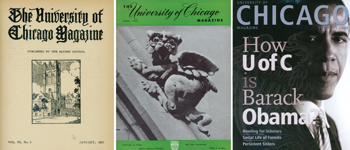
For the University of Chicago Magazine, it was time for a makeover. When we last redesigned in 2002, styles were different, and nine years later our need for an update showed. So we found a fairy godmother, the international design firm Pentagram, to work their magic and help us find a new wardrobe, one distinctly University of Chicago. Two of the firm's New York–based partners came to campus to get a feel for the place, learn its history, meet with deans and officers, and comb through the Magazine's century of archives.
A few months later they returned with their version of a ball gown. The Magazine would be slightly smaller and perfect bound, book- or journal-like. Its covers, unlike newsstand publications, would have thought-provoking images and no cover lines, appealing to our readers' sense of curiosity. The layouts would be free of frills and ornamentation, letting words and images take center stage. Alumni News would be tinted a rosy hue, evoking a nostalgia appropriate for that section. We editors were sitting taller in our chairs already.
We still had to put on the dress, stand still for alterations and fittings, and ride our horse-drawn carriage to the ball. We hope that, like Cinderella, we've kept our true character, our focus on informing, provoking, and entertaining. Our staples are still alumni, faculty, and the larger UChicago community. Yet we're wrapped in more modern, more engaging, and easier-to-follow packaging. Some readers will like our new look right away, others might take time to adjust, and some will hate it (see Letters for where to send missives). We hope most of you will decide we're much the same, only better.


